Select a checkbox:
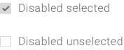
Disabled checkbox:
Select a checkbox:
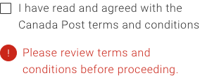
This is where error message copy goes.
Checkboxes let users select any number of options from a single list. A single checkbox lets a user turn an option on or off.
Select a checkbox:
Disabled checkbox:
Select a checkbox:
Use the codes below to add this component to your project. Download the latest version of the library to easily implement our full range of components.
Execute the following command to install this component.
Import the following into your app.module.ts file.
| Name | Type | Default | Description |
|---|---|---|---|
| id | string | checkbox-id |
id for the checkbox. id is the same as the name of the checkbox. |
| text | string | Checkbox text here |
The checkbox label. |
| value | string | Checkbox value |
The checkbox value. |
| checked | boolean | false |
Set the checkbox to checked by using “true”. Use "false" to set the checkbox to not checked. |
| disabled | boolean | false |
Disable the checkbox using “true”. Enable the checkbox using “false”. |
| (change) | Method |
Call a method if you want to capture value to do an action
|
Import the following in your theme or page.
A checkbox allows the user to select options without deselecting others. It includes a checkbox icon and a label describing the selection. If the objective is to have the user make one selection, consider using radio buttons.
Checkboxes are arranged like lists. Labels for checkbox items always appear to the right of the checkbox.
If checkbox copy is long and likely to wrap on smaller screens, make sure the copy wraps under the first letter of copy, not the checkbox button. When copy wraps, vertically align checkboxes with the first line of copy.
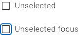
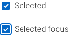
The entire checkbox and label area is interactive. Checkboxes can have the following states:
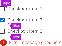
When there is an error, the message is placed under the last checkbox item.
Checkbox focus states allow users to navigate checkbox options without a mouse. To provide visibility and context, the focus state should span the entire line, not just the checkbox itself.
The user can navigate checkbox options with tab and toggle between checked and unchecked states using the space bar.
Screen readers should announce the element as a checkbox, its associated label and its state.
With the same header, use <div role=”group”> to group checkboxes. Screen readers will announce the group of checkboxes according to the label you specify.
A checkbox allows the user to select options without deselecting others. It includes a checkbox and a label describing the selection. If the objective is to have the user make one selection, consider using radio buttons.
Checkboxes are interactive and allow the user to select or deselect with a click. Content appears to the right of checkbox.
When writing for checkboxes, error messages let the user know what’s needed to proceed to complete the task. The error message appears under the last checkbox item.
| Guidelines | Examples | |
|---|---|---|
| Recommended length | Use as needed to complete the thought but try to keep it to one line | |
| Line wrap | Minimize but not recommended; checkbox item should wrap under itself and not under the bullet | |
| Phrasing | Short phrases that explain each item | |
| Case | Sentence case |
Use sentence case. It helps with legibility.
Keep the copy short for each checkbox item so it’s clear and not cluttered.
Use positive, active wording on checkbox labels to be clear about what will happen if the user selects that checkbox. Avoid negations in wording for on, off, and opt-in checkboxes because they’re confusing to the user.
Note that this component may require additional styling.
<mat-checkbox> provides the same functionality as a native <input type="checkbox"> enhanced with Material Design styling and animations.
Note that this component may require additional styling.
Checkboxes are an out-of-the-box functionality.
You simply need to select the Checkbox option from the toolbox on the right.
The styles for Checkboxes should be automatically applied along with the styles for their error states.
The Mendix toolkit can be found here.
When the checkbox has focus:
Focus remains on the checkbox once its state is changed.
The checkbox component can have the following ARIA properties:
When testing a checkbox, the tester must ensure: